utils.box.js
Offers many extra features & capabilities over the default Bootstrap modal
var box = new UTILS.Box({
    w: 700,
    center: true,
    title: 'Simple Box',
    classname: 'edit-box',
    fx: { effect:'slide-down' }
}).show();
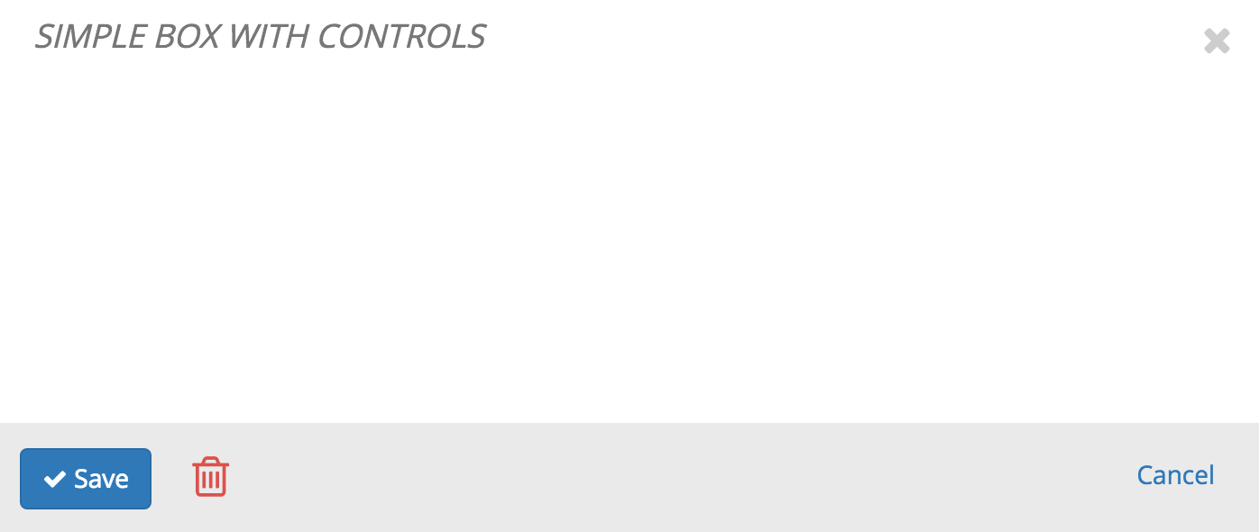
Simple Box With Controls Adding the .box-controls-close class to the Cancel button will automatically tell the UTILS.Box to add the click.clean.utils.box event listener
var controls = `
`;
var box = new UTILS.Box({
w: 700,
center: true,
title: 'Simple Box With Controls',
classname: 'edit-box',
controls: controls,
fx: { effect:'slide-down' }
}).show();
Code |
Output |
|---|---|
var box = new UTILS.Box({
    w:700,
    center:true,
    title: 'Simple Box With Events',
    classname: 'edit-box',
    buttons: { close:true, maximize:true },
    onCreate: function(){ recordEvent('on create'); },
    onShow: function(){ recordEvent('on show'); },
    onHide: function(){ recordEvent('on hide'); },
    onBeforeClose: function(){ recordEvent('on before close'); },
    onClose: function(){ recordEvent('on close'); },
    onBlur: function(){ recordEvent('on blur'); },
    onUnblur: function(){ recordEvent('on unblur'); },
    onBeforeStart: function(){ recordEvent('on before start'); },
    onStart: function(){ recordEvent('on start'); },
    onComplete: function(){ recordEvent('on complete'); },
    onMaximize: function(){ recordEvent('on maximize'); },
    onMinimize: function(){ recordEvent('on minimize'); },
    onContentHeightChange: function(){ recordEvent('on content height change ( triggered by the resizeSensor )'); },
    onContentUpdate: function(){ recordEvent('on content update'); },
    fx: { effect:'slide-down' }
}).show();
|
|
Standard subscription to all events is also availablePlease note that the event names are composed by combining the object name and event name The events are always triggered on the $target element, if no target element is specified $('body') is used. // utils.box + onCreate ==> utils-box-oncreate
$('body').on('utils-box-oncreate utils-box-onbeforestart utils-box-onstart utils-box-onshow',function(event,data){ console.log(event,data) });
|
|
simple box with max/min controls
var box = new UTILS.Box({
    w:700,
    center:true,
    buttons: { maximize:true },
    title: 'simple box with max/min controls',
    classname: 'edit-box',
    html: '', //some html for the main body
    fx: { effect:'slide-down' }
}).show();
simple box with all controls disabled ESC will still work to close the modal
var box = new UTILS.Box({
    w:700,
    center:true,
    buttons: { close:false, maximize:false },
    title: 'simple box with all controls disabled',
    classname: 'edit-box',
    html: '', //some html for the main body
    fx: { effect:'slide-down' }
}).show();
simple box without ability to close it manually ESC will not work work to close the modal
new UTILS.Box({
    w: 700,
    center: true,
    allow_close: false,
    title: 'simple box without ability to close it manually',
    classname: 'edit-box',
    fx: { effect:'slide-down' }
}).show();
var box = new UTILS.Box({
    w:700,
    center:true,
    title: 'simple box setting content',
    classname: 'edit-box',
    html: 'some HTML content goes here',
    fx: { effect:'slide-down' }
}).show();
UTILS.Box fx
fx feature allows for a custom way to display the box
var box = new UTILS.Box({
    w:700,
    center:true,
    title: 'simple box with different effects',
    classname: 'edit-box',
    fx: { effect:'...fill in the effect...' }
}).show();
Code |
effect |
|---|---|
fade-up |
|
fade-down |
|
fade-left |
|
fade-right |
|
slide-down |
|
slide-up |
|
slide-left |
|
slide-right |
|
shake |
|
zoom-in |
|
fade-in |
|
expand-in |
|
bounce-up |
|
bounce-down |
|
bounce-left |
|
bounce-right |
utils.boxes.js
Extends the regular UTILS.Box class and adds some extra features
APP.Box
APP.Box is a part of the APP.stack scope that keeps track of all opened boxes so that it becomes easier to manage them
Code |
Action |
|---|---|
var box = new APP.Box({ //extends UTILS.Box
    w:700,
    title: 'app box',
    center:true,
    classname: 'edit-box',
    fx: { effect:'slide-down' }
}).show();
|
|
var _openBox = function(options){
    var options = _.extend({
        w:700,
        title: 'app box',
        center:true,
        classname: 'edit-box',
        fx: { effect:'slide-down' }
    },options||{});

    return new APP.Box(options).show();
};

_openBox({
    w:600,
    title:'box 1',
    html:'box 2 will open in ',
    onShow: function(Box){
        var countdown = new UTILS.Countdown({
            target:Box,
            duration:3,
            color:'red',
            format:'s [sec]',
            onStop: function(){ _openBox({ w:300, title:'box 2' }); }
        }).start();
    }
});
|
The following steps are executed automatically b/c of APP.Box & UTILS.Countdown
|
var _openBox = function(options){
var options = _.extend({
center:true,
classname: 'edit-box',
fx: { effect:'slide-down' }
},options||{});
return new APP.Box(options).show();
};
_openBox({
w:600,
title:'box outer',
html:'',
onShow: function(Box){
Box.getMainbody().find('.action-link a').on('click',function(event){
event.preventDefault();
_openBox({
w:300,
title:'box inner'
});
});
}
});
|
APP.Alert
Notification boxes are to provide a simple way yet completely customizable
Code |
Extends |
Action |
|---|---|---|
new APP.Alert({
    type:'success',
    html:'some html'
}).show();
|
UTILS.Box | |
new APP.Alert({
    type:'success',
    html:'successful msg 1'
}).show();

_.delay(function(){
    new APP.Alert({
        type:'success',
        html:'successful msg 2'
    }).show();
},500);

_.delay(function(){
	new APP.Alert({
	type:'success',
	html:'successful msg 3'
	}).show();
},1000);
|
UTILS.Box | |
new APP.Alert({
    type:'info',
    html:'some html'
}).show();
|
UTILS.Box | |
new APP.Alert({
    type:'info',
    html:'different info',
    fx:{effect:'slide-up'}
}).show();
|
UTILS.Box | |
new APP.Alert({
    type:'warning',
    html:'some html'
}).show();
|
UTILS.Box | |
new APP.Alert({
    type:'error',
    html:'some html'
}).show();
|
UTILS.Box | |
new APP.Alert({
    type:'error',
    html:'some html',
    fx:{effect:'shake'}
}).show();
|
UTILS.Box | |
new APP.Confirm({
html:'
|
APP.Box |
API
Option |
Required |
Default |
Description |
|---|---|---|---|
| id | optional | 'b-'+UTILS.uuid() |
id of the box |
| w | optional | 600 |
width of the box |
| h | optional | auto |
height of the box |
| target | optional | $('body') |
target DOM element where to insert the box into |
| allow_close | optional | true |
all manual modal closing controls are disabled, including the ESC key |
| light | optional | false |
creates light box without close button and grey border (used to show error msgs) |
| title | optional | '' |
title of the box |
| html | optional | '' |
content of the box |
| controls | optional | '' |
control buttons at the bottom of the box |
| classname | optional | '' |
adds an extra class to the box (sometimes used to identify the set of boxes) |
| buttons | optional | { close:true, maximize:false } |
sets show|hide for certain buttons |
| dd | optional | false |
enable|disable drag n drop |
| center | optional | false |
center box |
| coords | optional | null |
position box at certain place |
| offset | optional | { left:0, top:0 } |
offset box from center when opening |
| fx | optional | { effect:null } |
the effect type |
| resizeDims | optional | null |
make box resize when browser resizes (previously specified dims will be overwritten, format TOPxRIGHTxBOTTOMxLEFT or single number) |
| freeze | optional | false |
freeze height after render |
| blur | optional | { color:'black', opac:0.3 } |
adds an overlay to the content of the box |
| dimmer | optional | false |
set the global dimmer, uses UTILS.Blur component |
| scrollable | optional | false |
enable content to scroll (up/down scrolling of the page), autotamically is used in responsive | behavior taken from Bootstrap modal |
Methods
Method |
Default |
Repeat |
Description |
|---|---|---|---|
| onCreate | null |
ONE-TIME | runs when box is first created |
| onShow | null |
REPEAT | stack of functions to execute when the box is shown |
| onHide | null |
REPEAT | stack of functions to execute when the box is hidden, NOT closed |
| onBlur | null |
REPEAT | stack of functions to execute when the box is blurred |
| onUnblur | null |
REPEAT | stack of functions to execute when the box is unblurred |
| onBeforeStart | null |
ONE-TIME | stack of functions to execute before the onStart runs |
| onStart | null |
ONE-TIME | stack of functions to execute when the box is shown (or animation starts) for the first time |
| onComplete | null |
ONE-TIME | stack of functions to execute after the special effects have finished |
| onBeforeClose | null |
ONE-TIME | stack of functions to execute right before the onClose runs |
| onClose | null |
ONE-TIME | stack of functions to execute after the box closed |
| onMaximize | null |
REPEAT | stack of functions to execute after the box is maximized |
| onMinimize | null |
REPEAT | stack of functions to execute after the box is minimized |
| onContentHeightChange | null |
REPEAT | stack of functions to execute when mainbody height changes |
| onContentUpdate | null |
REPEAT | runs when the content is updated |