utils.hint.js
Uses HINT.CSS (pure CSS tooltip library) to bring its features to JS. It makes use of data-* attribute, pseudo elements, content property and CSS3 transitions to create the tooltips.
Code |
Action |
|---|---|
$('.tooltip-link').on('mouseover',function(event){
	TOOLTIP.tooltip({
		target: $(event.target),
		type: 'default',
		direction: 'right',
		msg: 'tooltip right'
	});
});
|
|
$('.tooltip-link').on('mouseover',function(event){
	TOOLTIP.tooltip({
		target: $(event.target),
		type: 'success',
		direction: 'left',
		msg: 'tooltip left'
	});
});
|
|
$('.tooltip-link').on('mouseover',function(event){
	TOOLTIP.tooltip({
		target: $(event.target),
		type: 'warning',
		direction: 'top',
		msg: 'tooltip top'
	});
});
|
|
$('.tooltip-link').on('mouseover',function(event){
	TOOLTIP.tooltip({
		target: $(event.target),
		type: 'info',
		direction: 'bottom',
		msg: 'tooltip bottom'
	});
});
|
API
Option |
Required |
Default |
Description |
|---|---|---|---|
| target | required | |
DOM elm to show the hint on |
| msg | optional | |
message to show in the hint |
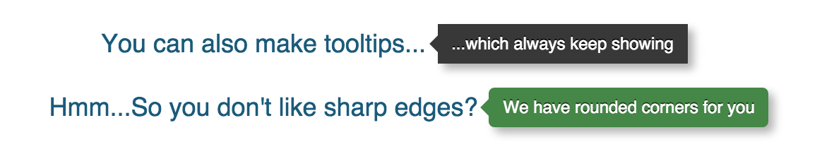
| color | optional | black |
specifies the color of the hint, possible combinations: red|yellow|green|blue|black |
| direction | optional | right |
direction of the tooltip, possible combinations: left|right|top|bottom |
| duration | optional | onhover |
duration the hint should be displayed for, possible combinations: onhover|always|[numeric value] in ms |
| is_error | optional | false |
marks if the hint is an error |
Methods
Method |
Default |
Repeat |
Description |
|---|---|---|---|
| onShow | null |
REPEAT | function to execute when 'onShow' happens |
| onBlur | null |
REPEAT | function to execute when 'onBlur' happens |
| onCreate | null |
ONE-TIME | function to execute when 'onCreate' happens |