utils.popover.js
A dropdown replacement, works well in situations where adding Bootstrap dropdown HTML is more strenuous
Code |
Action |
|---|---|
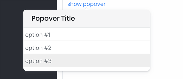
new UTILS.Popover({
	target: $('#p1a'), //show popover
	container: $('#popover-link-wrapper'),
	title: 'Popover Title',
	direction: 'top',
	css: 'clickable',
	items: [
		{ label:'option #1', value:'1' },
		{ label:'option #2', value:'2' },
		{ label:'option #3', value:'3' }
	],
	onShow: function(Popover){ /* activate some options on show */ },
	onSelect: function(Popover,value){
		$('#popover-link1-result').html(JSON.stringify(value));
	}
}).enable();
|
show popover
selected option |
new UTILS.Popover({
	target: $('#popover-link2'),
	width: 200,
	items: [
		{ label:'option #1', value:'1' },
		{ label:'option #2', value:'2' },
		{ label:'option #3', value:'3' }
	],
	blur: true //since no @container, defaults to $('body')
}).enable();
|
show popover w/ blur |
new UTILS.Popover({
target: $('#popover-link3'),
width: 200,
items: [
{ label:'option #1', value:'1', css:'red-option' },
{ label:'option #2', value:'2', css:'red-option' },
{ label:'option #3', value:'3', css:'red-option' }
]
}).enable();
|
show popover w/ red options |
new UTILS.Popover({
	target: $('#popover-link4'),
	width: 130,
	title: 'Options',
	items: [
		{ label:'Details', value:'details', icon:'mdi mdi-account-card-details', color:'#1e90ff' },
		{ label:'Enable', value:'enable', icon:'mdi mdi-clock-start' },
		{ label:'Notify', value:'notify', icon:'mdi mdi-cube-send' },
		{ label:'Remove', value:'remove', icon:'mdi mdi-delete-circle', color:'#d30' }
	]
}).enable();
|
show popover w/ icons |
API
Option |
Required |
Default |
Description |
|---|---|---|---|
| target | required | null |
DOM elm where the countdown will be inserted |
| title | optional | null |
Displays the title of the popover Note, if no title specified the entire title header will be removed |
| options | optional | {} |
Extends/overwrites the bootstrap popover options |
| direction | optional | 'bottom' |
The direction of the popover will be opened |
| blur | optional | false |
Uses UTILS.Blur to blur out the container the popover is placed in while opened |
| width | optional | null |
Width of the popover Note, defaults to Bootstrap width |
| hide_on_click | optional | true |
Whether or not to hide the popover when clicked outside of the popover bounds |
| toggle | optional | 'click' |
The event that triggers opening the popover Available options:
|
| template | optional | bootstrap template |
The inner HTML of the popover |
| container | optional | $('body') |
|
| items | optional | [] |
The options of the select to be used
|
| css | optional | null |
Custom CSS class that will be applied to the template |
Methods
Method |
Default |
Repeat |
Description |
|---|---|---|---|
| onShow | null |
REPEAT | Triggered when popover is shown |
| onHide | null |
REPEAT | Triggered when popover is hidden |
| onSelect | null |
REPEAT | Triggered when an item is selected |
| onCancel | null |
REPEAT | Triggered when popover is cancelled (user clicked outside popover bounds) |